
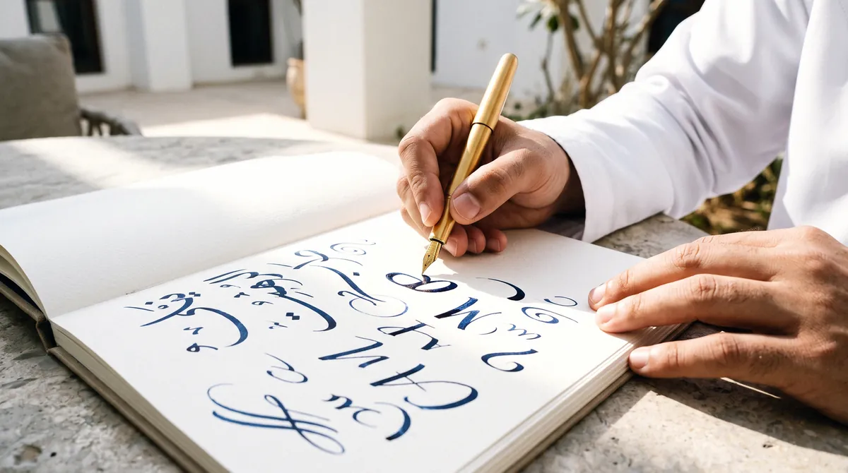

- Treat Arabic and English as two expressions of one idea, designed together from the start.
- The Arabic logotype needs its own weight, proportion and composition decisions.
- Choose a matched Arabic and Latin type pairing, licensed for every use.
- Write the bilingual rules into a brand book and test them on real applications.
Two languages, one first impression
In Oman, a customer may meet your brand in Arabic on a shop sign or a WhatsApp profile, then meet it again in English on LinkedIn or an invoice. Both encounters shape the same impression. If the two versions look like they came from different companies, the brand loses some of the trust it was built to earn.
Many young businesses still design in English first and add Arabic at the end, often by typing the name in a default font beneath the logo. The result is a Latin brand with an Arabic caption. A bilingual identity works differently. It treats both languages as full expressions of one idea, designed together from the first sketch.
Start with one idea, expressed twice
Before any drawing begins, agree on what the brand stands for in a sentence that makes sense in both languages. Positioning, audience and tone should be written in Arabic and English side by side, because a phrase that sounds confident in one language can sound stiff or boastful in the other.
- Write the brand promise in both languages and check that each version feels natural
- Define the tone of voice with examples, such as a greeting, an apology and a price announcement
- List the words the brand should never use, in Arabic and in English
The Arabic logotype deserves its own design
Arabic and Latin scripts behave very differently on the page. Arabic is cursive, with letters that change shape depending on their position in a word. It has its own proportions, its own rhythm of ascenders and descenders, and dots that carry meaning. A Latin wordmark cannot simply be mirrored or traced into Arabic.
Weight and optical size
A bold Latin logo paired with a thin Arabic one makes the Arabic look secondary. Match the visual weight of the two, judged by eye rather than by the font file's weight number, so that neither version dominates when they sit together.
Height and proportion
Arabic letterforms often extend further above and below the line than Latin ones. Decide how the two will align, whether by the baseline, the center line or the overall height, and fix that relationship in every lockup.
Direction and composition
Arabic reads right to left. A symbol placed to the left of an English wordmark may need to move to the right of the Arabic one, or sit above both. Plan horizontal, stacked and single-language versions from the start, so nobody improvises them later.
Choosing an Arabic and Latin type pairing
Typography carries the brand into every document, slide and screen. A good pairing gives the two scripts a family resemblance: similar contrast, similar warmth, similar seriousness.
- Check that both typefaces offer the weights you need, from light to bold
- Test legibility at small sizes on a phone screen and on a printed receipt
- Confirm the licenses cover print, web, apps and documents for both scripts
- Choose a fallback pair for email and office software, where custom fonts may not load
Resist the urge to add a new typeface for every project. Two families, one for each script, used across a disciplined range of weights, will carry most brands further than a large collection ever could.
Color, imagery and layout in both directions
Color travels between languages more easily than type, but layout does not. A page designed left to right has to be mirrored for Arabic, and not everything should flip.
- Mirror the layout grid, navigation and reading order for Arabic pages
- Flip directional icons such as arrows, and leave others, like play buttons and logos, unchanged
- Decide whether Arabic text will use Arabic-Indic digits, and apply the choice consistently
- Choose imagery that reflects the people, dress and places your customers recognize
Small inconsistencies here are what make a bilingual brand feel unfinished in one of its languages. Getting them right once, in the rules, saves correcting them on every new piece of work.
Write the rules down in a brand book
An identity is only as consistent as the rules that come with it. Without a brand book, the next printer, developer or freelancer will make their own decisions, and within months the brand exists in several slightly different versions.
A useful bilingual brand book covers at least the following:
- Every approved lockup, in Arabic, English and both together
- Clear space, minimum sizes and placement rules for each lockup
- The color palette with print and screen values
- The type pairing, with sizes and hierarchy for each script
- Bilingual layout examples for documents, social posts and signage
- Examples of misuse, so suppliers know exactly what to avoid
Insist on receiving the source files alongside the brand book. Rules are of little use if you cannot open and edit the files they describe.
Test the identity before anything is printed
A logo that looks balanced on a presentation slide can fail at sixteen pixels or on a building. Before you sign off, apply the identity to the places customers will actually see it.
- A browser tab icon and a social profile picture
- A storefront sign viewed from across the street
- A business card, printed on both sides
- An invoice that combines Arabic and English text
- A social post with an Arabic headline and English details
Look for moments where one language feels like an afterthought. Those are the places to fix now, while changes are still inexpensive.
Keep the identity consistent as the business grows
Most brands drift slowly rather than break suddenly. A new staff member resizes the logo, a printer substitutes a font, a social post uses a color that is almost right. Each change seems harmless. Over a year, they add up to a brand that no longer matches its own rules.
- Name one person who approves anything that carries the brand
- Send the brand book to every new supplier before work begins
- Build ready-made templates for the materials you produce most often, such as social posts and proposals
- Store approved logo files in one shared place, and remove old versions
- Review a sample of recent materials every six months against the brand book
Pay particular attention to the Arabic side. Because it is harder to check for someone who does not read Arabic, errors such as disconnected letters, reversed text or the wrong font tend to survive longer there.
How GBN approaches bilingual identity
GBN designs the Arabic form of a brand as a first-class expression of it, because in this market it is often the version customers see first. Identity work includes a matched Arabic and Latin typography system and a brand book with usage and clearance rules, and all source and print-ready files are released to the client in full.
If you are planning a brand that has to work in both languages from the first day, a diagnostic conversation with GBN is a good place to test the idea before any design begins.
Talk it through with GBN
A free diagnostic call shows you the structure, the timeline and the real cost of launching your company.
Keep reading

Choosing the Right Domain Before You Register
The matching .com, sensible alternatives and who holds the registration: what to settle before your name is fixed.

The Real Cost of Launching a Company in Oman
An indicative, line-by-line budget for the name, identity, domain, site and documents, plus the costs founders forget.

The Day-One Document Kit Every Company Needs
A function-by-function checklist of the HR, sales, legal, governance and finance documents to have ready on day one.